Authors (alphabetical order)
Hoseyn A. Amiri, Jack Henderson, Mia Markovic, and Ethan T. Schneider
Table of Content
- Authors (alphabetical order)
- Problem Definition
- Introduction/Background
- Video Summary
- Data Collection
- Methods
- Results and Discussion
- Conclusion
- Contribution Table
- Gantt Chart
- Citations
Problem Definition
With recent advances in computing, we have seen an increasing shift of autonomous vehicles from controlled research and development environments to highly chaotic and intractable human environments – this shift demands we question how these increasingly prevalent autonomous vehicles will harmoniously navigate environments designed for and historically dominated by humans. Perhaps the most quintessential case of this is in emergent autonomous vehicles whose ability to navigate unattended is primarily reliant on the use of perception and the information that longstanding traffic signs, symbols, and lighting provides. It is imperative that we meet the high demands of mixed human-autonomous transportation by the provision of a model for robust sign identification for autonomous vehicles to aid these vehicles to safely and predictably conduct themselves around their possibly more intuitive, more perceptive human counterparts while driving remains a shared human-autonomy effort.
Introduction/Background
The aim of TraffiCluster is to present a vision-based machine learning approach to classifying traffic signs, which would enable autonomous vehicles (heavily reliant on their in-built computer perception for navigation) to conduct themselves in a safe, predictable and equitable manner with respect to shared human-autonomy roadway use. Classifying traffic signs is no novel problem in ML research, and historically, several models [3] have proven that approaches such as Histogram of Oriented Gradients (HOGs), K-d trees and use of random forest algorithms can be quite effective to this end. The state of the art, as it relates to sign classification, focuses on the use of deep learning approaches, such as those demonstrated in Zhang et al. [2], wherein the group’s deep learning model achieves 93.16% accuracy tested against the CIFAR-10 dataset, a well-known repository of over 60,000 classified color images popularly used in computer vision research. Other works at the forefront of machine learning research focus on use of convolutional neural networks (CNNs), wherein researchers such as those cited in [4,5], Abdel-Salam et al. And Singh et al., respectively, each achieves over 98% accuracy in testing their respective datasets.
TraffiCluster, a Georgia Tech-affiliated machine learning project group, aims to use a refined subset of Mapillary Traffic Sign Dataset [1], a dataset containing some 100,000 images of 300 classes of traffic signs across 6 continents. Specifically, TraffiCluster uses a subset centered around the Georgia Tech campus and nearby Midtown Atlanta in Atlanta, GA. The primary features of this dataset, as they are provided, include image resolution, bounding box coordinates, category label, and descriptive properties of the sign, such as ambiguity of classification, presence of occlusions, and whether the sign is directive or informative. But the subset of data TraffiCluster is using just contains cropped images of signs, with features of image ID number, whether it was original or augmented, and the actual sign label from the dataset. One of the results of TraffiCluster’s work herein has been extracting the relevant parts of the Mapillary dataset, identifying important features, and using machine learning approaches such as feature extraction and forward feature selection to reduce the computational complexity in processing such a large subset of this massive image data repository. This will be thoroughly discussed in the following sections.
Video Summary
Below are the video summaries of the project.
TraffiCluster Proposal Presentation (CS7641)
TraffiCluster Final Presentation (CS7641)
Data Collection
The intent of TraffiCluster was to use Mapillary’s Traffic Sign Dataset, restricting the selected subset of the broader Mapillary Traffic Sign Dataset to just North America. Unfortunately, however, the pre-processed dataset included no regional information to aid in separating by continent, whereas the sample dataset had been neatly segmented by continent. From sample to full dataset, in retrospect, it was somewhat naïve to assume it would be a simple task to extract just the desired North American subset. Given the sheer volume of data captured in Mapillary’s Traffic Sign Dataset, which has steadily expanded since its inaugural 2019 release, much of which is messy, poorly labeled, low fidelity user-submitted image data, the disorder of such a large amount of data makes this a difficult task. Given the specific aims of TraffiCluster’s use of the Mapillary dataset, it was clear the only viable means by which to filter data to include just the desired candidates would be gathering information from the Mapillary API to select and filter data based on internally-specified criteria.
In order to do this, based on the map visuals provided at https://www.mapillary.com/app, it was decided that a region closer to home in Atlanta, Georgia, would be used, specifically one centered around Georgia Tech and nearby Midtown Atlanta. Using Mapillary’s interactive map, it is simple to filter the map data based on desired data. TraffiCluster makes use of “All traffic signs” under the “Show traffic signs” option, which captures all traffic signs in the area shown below. From here, it was simply a matter of downloading the resulting traffic sign data. The download provided is a JSON format file that contains information about each traffic sign, including its geographical coordinates, its first- and last-seen date, its label or classification, along with its unique ID. With this list of unique sign IDs and their respective labels, a simple query was run on the API for all images that a given sign appeared in, querying the API for each such image. The API queries return information relating to all detections within the given image, including the expected traffic signs as well as detected people, natural features, and other miscellaneous objects. From these queries the unwanted noise of other detections was filtered out, keeping just the signs and obtaining the bounding box geometry to make easy work of cropping from each image all detected signs.
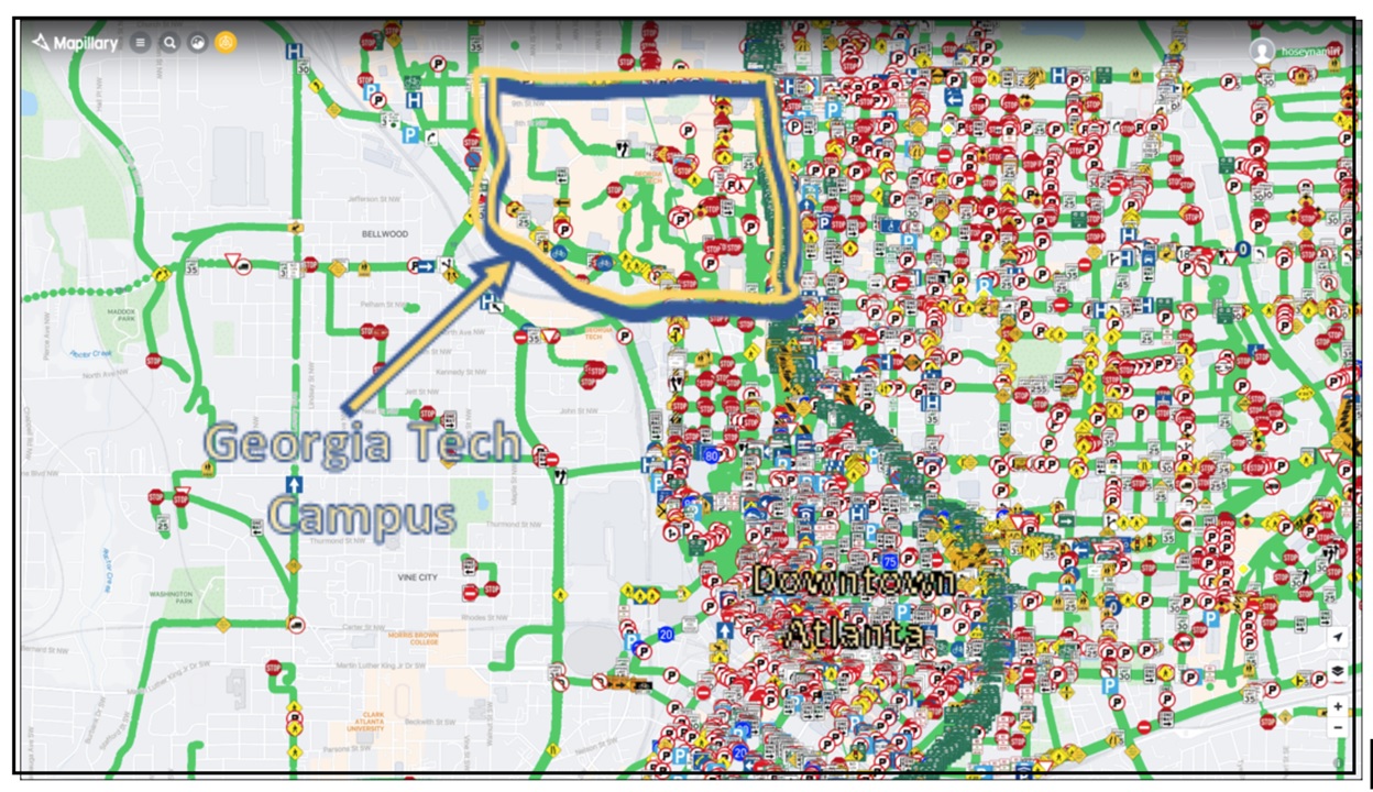
Fig. 1. All traffic sign locations within the area of interest (Georgia Tech and its periphery), roughly 22,700 user-submitted images from 2019 to the present.
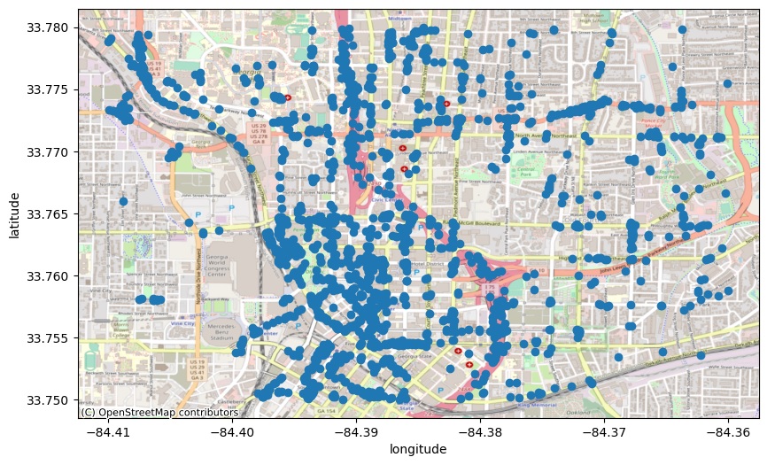
Fig. 2. 2,000 discrete traffic sign locations (15,000 images) visualized in Python using the Contextily package and OpenStreetMap’s Mapnik toolkit.
It was discovered that several images (and likely many more unaccounted for) provided by Mapillary were seen to depict scenes with more than one of the same sign. To help distinguish between these duplicates and a multiplicity of signs synthetically produced via data augmentation, a naming scheme was devised to avoid bias and have a uniform nomenclature between pre-processed and post-processed (cropped or augmented images), named “ImageID(Label).jpg”. This naming convention overwrote similar labels in an image with a unique ID, resulting in filtering out roughly 15% of cropped images of traffic sign duplicated unknowingly. Further steps were taken to eradicate data that seemed mislabeled, overly abundant (biasing), or anomalous.
Fig. 3. An example of user-submitted images depicting duplicated traffic signs, a common occurrence in the Mapillary dataset, which required pre-processing.
Fig. 4. A rare example of user-submitted images where Mapillary classified miscellaneous signage as a “maximum-speed-limit-10” sign.
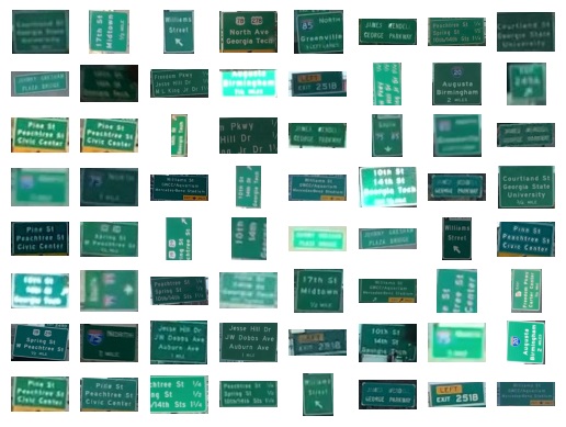
Fig. 5. The most commonly-featured labeled sign – “highway-interchange” – appearing over 7,000 times due to Atlanta’s highway-dominant infrastructure.
Once all images were cropped to capture just their respective signs, the new sign label distribution was analyzed. In sum, there were a total of 154 distinct traffic sign label classes. This was a byproduct of Mapillary’s traffic sign label naming convention of “{category}–{name-of-the-traffic-sign}–{appearance-group},” where it’s inferred the subdivision of image classes by category, name, and appearance group is an over-compartmentalization. Of label categories, there are 4 high-level types – regulatory, information, warning, and complementary – while appearance group refers to the fact that the same sign may appear to be subtly different depending on the country or use context. To reduce complexity, it was decided to strip all traffic sign labels of their categories and appearance groups to just contain the name-of-the-traffic-sign designator, as these constitute extraneous information as it relates to the aim of this model. For the purposes of TraffiCluster, the only important designator considered is sign type. By performing some pre-processing of data and filtering out on these bases, the number of class labels was successfully reduced from 154 to 117.
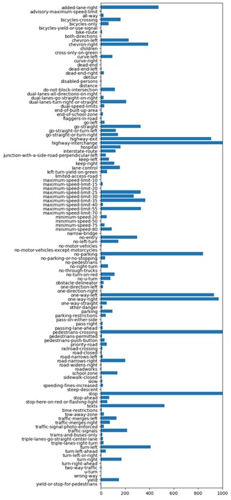
Fig. 6. Histogram of traffic signs before data cleaning and pre-processing, where the horizontal limit is 1000 to avoid muting signs with nominal occurrence.
In analyzing the dataset, it was apparent that the data was biased – both in featuring dominating signage and in the inclusion of near standalone signage for which only a given sign appeared only a handful of times in the dataset of nearly 20,000 images. There were also many instances in which, due to the area in which the image data was collected being densely mapped with highways and interchanges, the image data was highly dominated by these highway and highway interchange signs, many of which appeared in a superfluous number of user-submitted images. Just the highway-interchange label alone had around 7,000 images out of 19,685 images resulting from the initial filtering. To preserve the existing label types while also reducing the amount of bias present in the highway-dominated dataset, it was deemed appropriate that some images (namely duplicates) be removed while others (namely those signs verging on stand-alone) have data augmentation performed on them to increase their representation in the trainable data set. In creating the dataset .csv file, incoming images were analyzed and reviewed under certain criteria. Namely, any class labels for which there were fewer than 20 images total, along with their constituent images, were not included in the dataset. To reduce bias that came with an overabundance of highway-centered signage and other such similar cases, where there was a large amount of a single class label, the limit was set at 1200 images per class.
Before processing could be performed on the signs, the images had to be properly formatted to be input into the model. Using VGG16 for feature extraction, which will be explained later, the input images had to be modified to a size of 448x448x3, as per VGG16’s requirements, where the dimensions here correspond to height, width and color channel count, respectively. As the images were user-submitted and of varying aspect ratios and pixel resolutions, most images had to be rescaled to fit the requisite square aspect ratio of 448x448x3. Images were rescaled using PyTorch’s nn.functional.interpolation function and then transforms.functional.resize was used to fix the max image dimension to 448 pixels. Both of these functions preserve the original cropped image’s aspect ratio, so to ensure input data was a square aspect ratio, the remaining space was filled with 0 values (black space) using transforms.functional.pad to meet the requirements of VGG16.
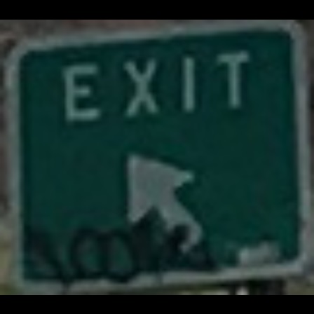
Fig. 7. An example of an exit sign, which needed to be up-scaled, whose bounding box was non-square and thus required padding top-and-bottom to meet the 448x448 VGG16 requirement for inclusion in the dataset.
For any labels appearing in between 20 and 50 images, 11 transformations were performed per image. Within the PyTorch library, RandomAdjustSharpness, RandomSolarize, RandomAutocontrast, and ColorJitter transform methods were used in data augmentation. The first three methods listed adjust an image’s sharpness, solarizes the image, or adjust the contrast randomly. Each of these methods was run once, with all probability values set at 1 while other necessary values were chosen randomly every time the transform was called. ColorJitter allows the user to randomly change an image’s brightness, contrast, saturation, and/or hue. ColorJitter was called a total of 8 times – twice per feature being changed – where the actual values by which the feature was changed were determined randomly at runtime.
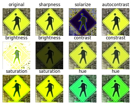
Fig. 8. An example of the different kinds of transforms performed on each image for which the corresponding histogram sign type count was low.
Once this was all run, the resulting dataset was comprised of 23,487 images with 78 traffic sign class labels. Using the criteria for anomalous data, 148 images were removed from the original API call crops due to having too few images associated with their traffic sign class labels while using the defined criteria for superfluous (biasing) data, another 4377 were removed for having too much data associated with their given label. 8,327 images were created using data augmentation. By these means, it was possible to create a dataset with a far more even distribution of images and class labels as compared with the original API call crops. Some of the removed labels include disabled-persons, flaggers-in-road, and no-pedestrians.
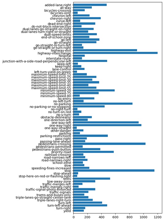
Fig. 9. The distribution of sign counts to sign labels post data augmentation and processing.
Methods
Unupervised learning
The current methodology consists of first performing feature extraction, followed by dimensionality reduction, and finally by employing an unsupervised method to cluster data. In terms of feature extraction, the plan was initially to make use of VGG16 [6], which is a pretrained deep convolutional neural network for large-scale image recognition. The standard VGG16 model was modified by removing the final layers of the network, to prevent classification of the images and instead output a feature vector. VGG16 takes in RGB images of size 448x448x3 – where dimensions correspond to height, width, and color channel - which was the reason the images were rescaled to fit the model’s criteria for input data. VGG16 returns 4096 features for each datapoint. After performing feature extraction, the next step was dimensionality reduction. Principal Component Analysis (PCA) was used and the number of features was chosen such that 97% of the variance in the data was preserved. For VGG16, this required reduction of total features from 4,096 to just 500, which was concluded through analysis of the graph below (Fig. 10.), which plots the number of features vs. variance.
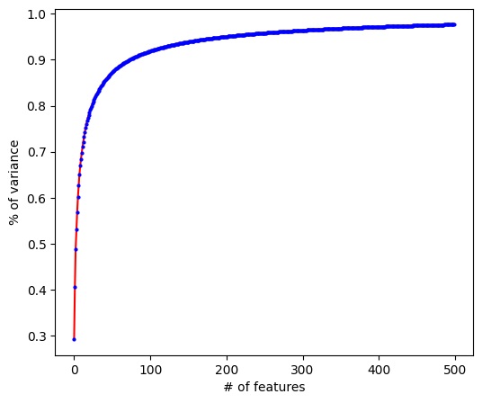
Fig. 10. Number of features versus percent of variance kept using PCA on the dataset after being run through VGG16.
Once finished with PCA dimensionality reduction on the VGG16 features, next came training the unsupervised model. The plan was to use KMeans to for data clustering, but other methods like GMM, DBSCAN, and Hierarchical Clustering were tried also. KMeans was initialized using KMeans++, which was run using values of K ranging from 2 to 90. KMeans was analyzed to determine the best value of K to use by plotting the distortion values and using the elbow method. It was determined that a value around K=16 clusters would be the best for the data. It was at this point that it became apparent there were some problems with the model used, as the distortion values were much smaller than were expected based on similar models, and further analysis only provided reassurance of this observation.
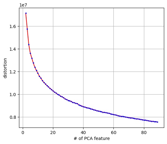
Fig. 11. The number of cluster centers versus distortion score for 500 features (as determined by PCA) after being run through KMeans.
It was decided that the other clustering methods listed above be run, but this resulted in minimal improvements. DBScan provided very little benefit and it was found that the data tended to either cluster tightly together or not cluster well at all. GMM provided slight improvement as measured by the DB-Index and Silhouette Coefficient, but gained little benefit over other methods. After testing, which is explained further in the results section, it was found that VGG16 was likely not a great feature extractor for the purposes of the Mapillary subset used. HOGs feature extraction was then used in place of VGG16. The rest of the pipeline proceeded as normal, that is, by running PCA and then testing the various unsupervised methods listed above, but similar results were seen as to using VGG16.
After work on the supervised section was completed, we went back to improving our unsupervised learning by using the same autoencoder for the supervised section as a feature extractor. The encoder portion was used to extract features, which PCA, then Kmeans Clustering were applied to the features. This gave better results, which will be discussed later in the Results section.
Supervised learning
For our supervised learning portion, we have two different models we tested out: an autoencoder combined with a fully connected (FC) neural network, and CNN layers combined with a fully connected neural network.
With the autoencoder-based network, we first had to train an autoencoder on our data. We were inspired by [7], to formulate our autoencoder model. We built a model similar to the one shown in Fig. 12 to reconstruct the input images of traffic signs with (56, 56, 3) shape. Afterwards, for classification, used the encoder block, which has rich information at the bottleneck. We hypothesized that if we could train a better autoencoder, it would aid the classification model. Therefore, we optimized the architecture given the time we had (Fig. 13). We tried to make the encoder and decoder fairly similar in architectural structure, but made small changes to hyperparameters as we went. Once the encoder and decoder portions were trained, we should have a rich latent space output from the encoder that would be more informative than just pixel values and be able to use this output as input to a fully connected neural network. So, we froze the parameters of the encoder and added the layers of our fully connected neural network with only one 128-neuron hidden layer followed by a 78-neuron output layer in order to just train the fully connected portion of the network (Fig. 13).
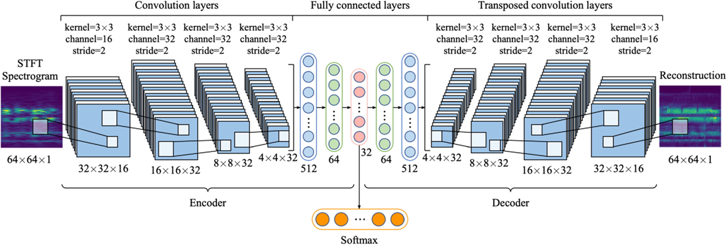
Fig. 12. Schematic of the hybrid autoencoder used in [7].
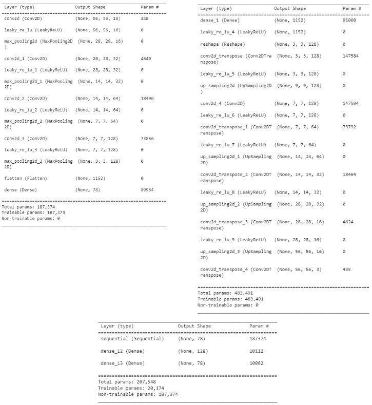
Fig. 13. The summary of the tuned encoder (left), the tuned decoder (right), and the fully connected layer (bottom).
Additionally, we also tested out a CNN-based network. This network comprised of layers of Keras Conv2D, LeakyReLU, MaxPooling, and Dropout for the CNN part, and then the output was flattened and fed into the fully connected component, which consisted of Dense, LeakyReLU, and Dropout layers, before finishing off with a final Dense layer of 78 (since we have 78 classes) and a softmax activation layer because we are doing classification. We tested multiple different combinations of layers for the CNN and FC parts of the network, and also experimented with increasing and reducing the number of parameters. Our final CNN-based model ended up with 1,784,542 parameters. We had 3 convolutional blocks, where each block consists of a Conv2D, LeakyReLU, Conv2D, LeakyReLU, MaxPooling, and Dropout layer, 2 fully connected blocks, where each block consists of a Dense, LeaklyReLU, and Dropout layer, before ending with a final Dense layer with an output size of 78 and a softmax activation.
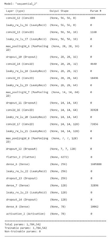
Fig. 14. Architecture of our CNN-based model.
Results and Discussion
Unsupervised learning
As stated in the method section, the elbow method was used to determine that a value of 16 clusters for KMeans using VGG16 feature extraction was best. Some visuals of the clusters produced are given below.
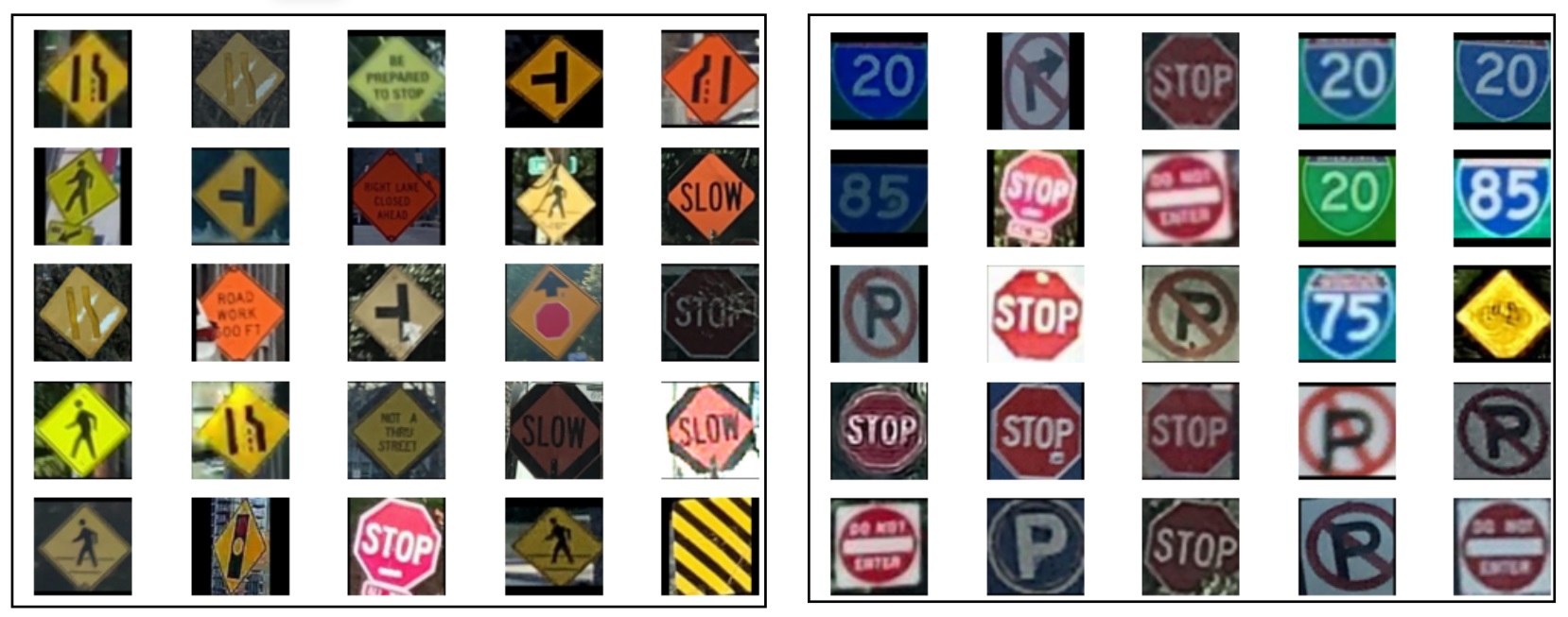
Fig. 15. Two sample clusters resulting from KMeans (K=16) and PCA reduced features from VGG16. The cluster at left is comprised of mostly yellow/orange signs, while the other cluster has mostly 3 main sign types. Neither is perfect, with the evident inclusion of the occasional misfit sign.
This model was evaluated using the Silhouette Coefficient and Davies Bouldin Index, where the resulting values were 0.0833 and 2.2326, respectively. These results are indicative of a sub-par model. For this reason, subsequent testing was performed using GMM, DBSCAN, and Hierarchical Clustering. GMM gave slightly better values for the Silhouette Coefficient than KMeans provided. For DBSCAN, a variety of epsilon values were tested, all using a minSamples of 15, but there was difficulty getting the data to create reasonable clusters. Our best DBSCAN model (using an epsilon value of 3) produced a Silhouette Coefficient of -0.2074 and a Davies_Bouldin Index of 1.1613. Hierarchical clustering produced a dendrogram where a lot of data points were combined at one step, which was not indicative of successful clustering either.
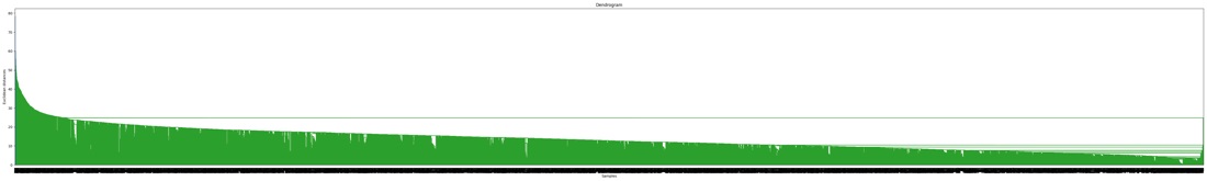
Fig. 16. The dendrogram from running Hierarchical Clustering on the features reduced to 500 from PCA.
This marked a necessary point at which to consider the clusters produced by KMeans. PCA was used to reduce the number of features to 2 to enable plotting of the data, color-coding each data point with their respective clusters from KMeans. This can be seen in the figure below, where the whole dataset is fairly well grouped and there are no clearly visible division in the data. Consequently, it is difficult to conclude these are properly generated clusters. Therefore, it is suspected that the values obtained from feature extraction may be the underlying issue.
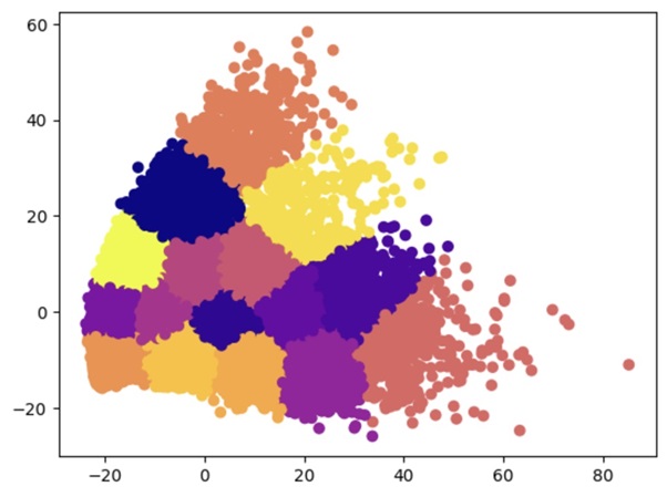
Fig. 17. Plot of our data using PCA reduction to the top 2 features retrieved by PCA, color-coded by the clusters determined by running KMeans with 16 centers.
When looking at some of these results, it was observed that VGG16 was producing similar values for images for visible different images – something that was unexpected. For example, it was noticed that a lot of images that were originally a very low resolution (so they were low even lower quality when stretched to fit the criteria for VGG16 data) were getting similar values from VGG16, so they were being clustered together instead of by the sign type. We assume this may be because VGG16 expects a higher resolution image to be reduced to the height and width of 448, so it has a difficult time extracting the same quality of features from our dataset, which had to be scaled up (rather than compressed) to reach 448x448.
Alternatively, it was decided that HOGs could be used as the model’s feature extraction method. A sample HOGs output image is provided below, which appears promising insofar as potentially producing better results than VGG16 did. Performing the same process as with VGG16 feature extraction, it was found that the feature space could be reduced with the use of HOGs to about 600 features while retaining roughly 90% of the variance. Additionally, running KMeans evaluated via the elbow method, as shown in Fig. 19, it can be seen that the distortion values are very high in comparison to similar models and especially when comparing against the previously used VGG16 model. Tweaking the output for HOG leads to different distortion values, bringing it down greatly, while improving Silhouette Coefficient and Davies-Bouldin Index to 0.138 and 1.939, respectively.
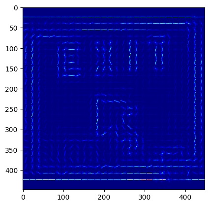
Fig. 18. Histogram of Oriented Gradients (HOGs) for one image in our dataset.
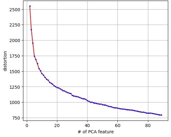
Fig. 19. The number of cluster centers versus distortion score for the HOG feature extractor (as determined by PCA) after being run through KMeans.
After work was done on the supervised section, we decided to try using the autoencoder with some slight alterations as a feature extraction tool. Specifically, we added an additional convolutional layer with 256 filters before flattening, and an additional 36 neuron dense layer at the end of the encoder using L1 regularization. After training the autoencoder and running PCA, we found that the first two features made up 100% of the variance, so we reduced the feature space to 2 features, both to speed up the training process and to plot the feature space. KMeans clustering was then performed on this feature space, producing an elbow curve to determine the best cluster amount. After choosing the elbow of the curve, calculating the Silhouette Coefficient and Davies-Bouldin Index gave values of 0.34 and 0.80 respectively. While these values are still not the best, they are a great improvement over using VGG16 and HOGs feature extraction methods. This gives us more confidence that using the autoencoder for both the unsupervised and supervised sections is a better idea than using VGG16 or HOGs for feature extraction for this task.
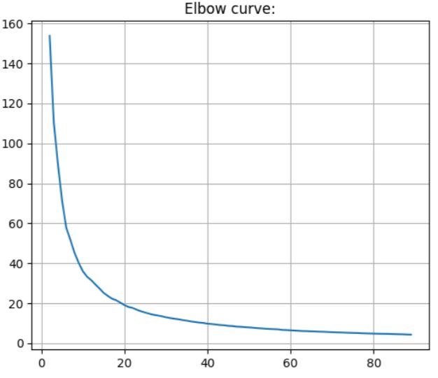
Fig. 20. The number of cluster centers versus distortion score for the autoencoder feature extraction after being run through PCA feature reduction and KMeans.
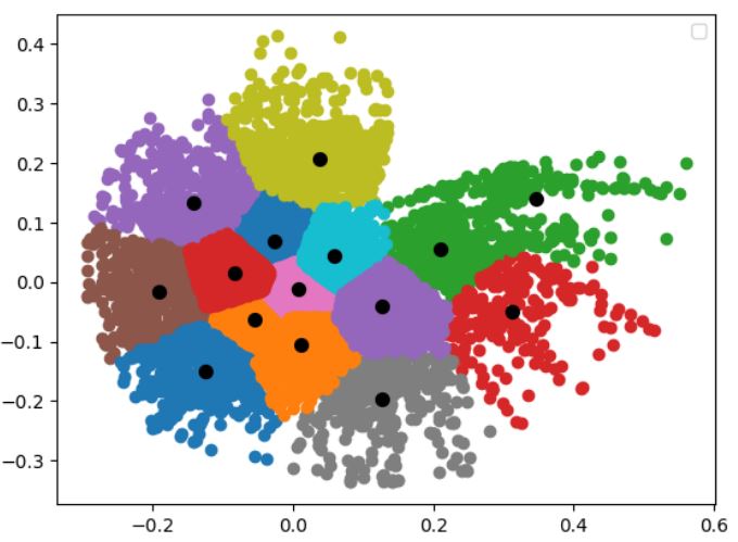
Fig. 21. Plot of the outputs from the autoencoder feature extraction and running through PCA to reduce the features down to two, with the cluster centers plotted.
Supervised learning
In order to test our data, we first had to make a few changes to our dataset. We had to reduce the images to 56x56x3, as we were using Google Colab to run our experiments and it was unable to hold all the images at 448x448x3 in RAM. We also randomly shuffled and then split the data into a 70-20-10 split for training, validation, and testing sets, respectively.
For testing our autoencoder, as a rule of thumb, we made the encoder and decoder almost similar and then tweaked the number of layers, the number of filters, the activation function of each layer, the number of epochs, the loss function (binary cross-entropy and MSE), the learning rate, the optimizer (Adam, Nadam, and RMSprop), the type/size of the bottleneck (conv layer and dense layer), and whether to use dropout or regularizations for the bottleneck. To prevent overfitting, we used an early stop with only 100 epochs and a small learning rate of 0.0005. We set the activation functions of the middle layers to LeakyReLU as it performed better while for the last layer, Linear worked the best among ReLU and Sigmoid since it could penalize negative and over-the-one values. Using a dense layer for the bottleneck resulted in richer information and hence a more accurate prediction when trained by MSE loss function with Adam. Figs. 22 and 23 compare the training and test output of a poor autoencoder with the 20% dropout with the tuned autoencoder that captures subtle details of the input image. The trends of their losses are shown in Fig. 24. We can infer that losing even 20% of the information can be detrimental to the network in image reconstruction and generalization. We can also see that the tuned network cannot reconstruct the texts on signs which are deemed acceptable for the current application. The tuned autoencoder’s summary was given in Fig 13.
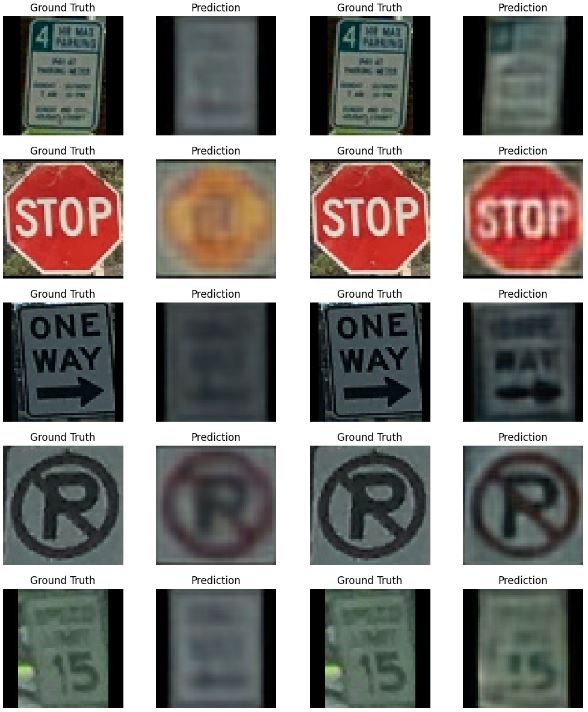
Fig. 22. The training output of a poorly-trained autoencoder with 20% dropout (left) versus the tuned autoencoder (right).
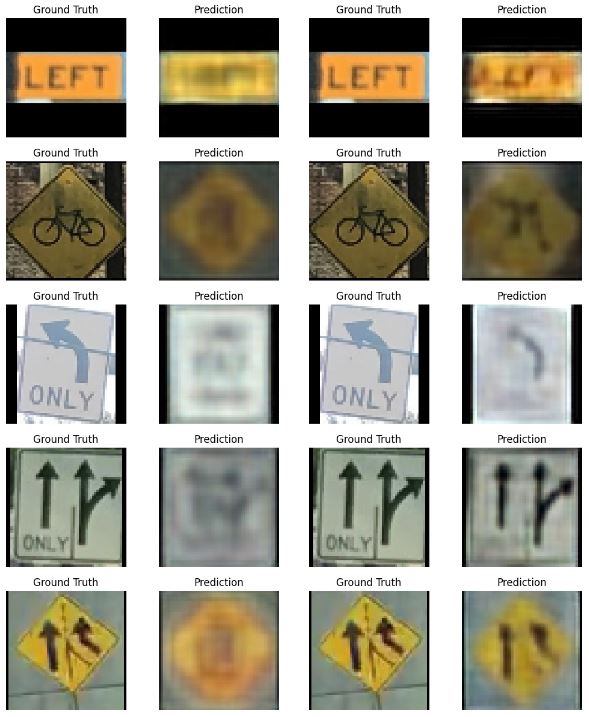
Fig. 23. The test output of a poorly-trained autoencoder with 20% dropout (left) versus the tuned autoencoder (right).
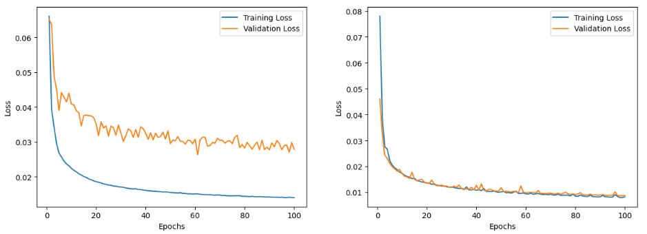
Fig. 24. The training history of a poorly-trained autoencoder with 20% dropout (left) versus the tuned autoencoder (right).
After training the encoder and decoder, we separated out the encoder portion and connected it to our fully connected layers. Taking advantage of transfer learning, we froze all layers of the encoder leaving the classification model with ~20,000 parameters to train. We noticed that making the network bigger would cause overfitting. Hence, we did the early stop again with only 30 epochs and a typical learning rate of 0.001 and set the loss function to sparse categorical cross-entropy. The training history and the confusion matrix of the test set are shown in Figs. 25 and 26. We monitored the accuracy of the model and it plateaued around 92.7%, 91.2%, and 90.4% for training, validation, and test sets respectively.
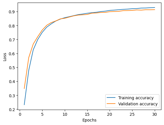
Fig. 25. Training and validation accuracy for the model consisting of the frozen encoder connected to the trained fully connected layers.

Fig. 26. Confusion matrix for the autoencoder-based model using test set.
To analyze the errors or the inaccuracy of the classifier, we plotted the distribution of the misclassified labels in Fig. 27 followed by a sample of them in Fig. 28. It seems that the classifier failed to correctly predict the noisy images or the ones that are too dark or polarized, which was from our data augmentation. In some cases, it was difficult for the model to distinguish left from right. We will analyze them through the output of the encoder and the whole autoencoder.
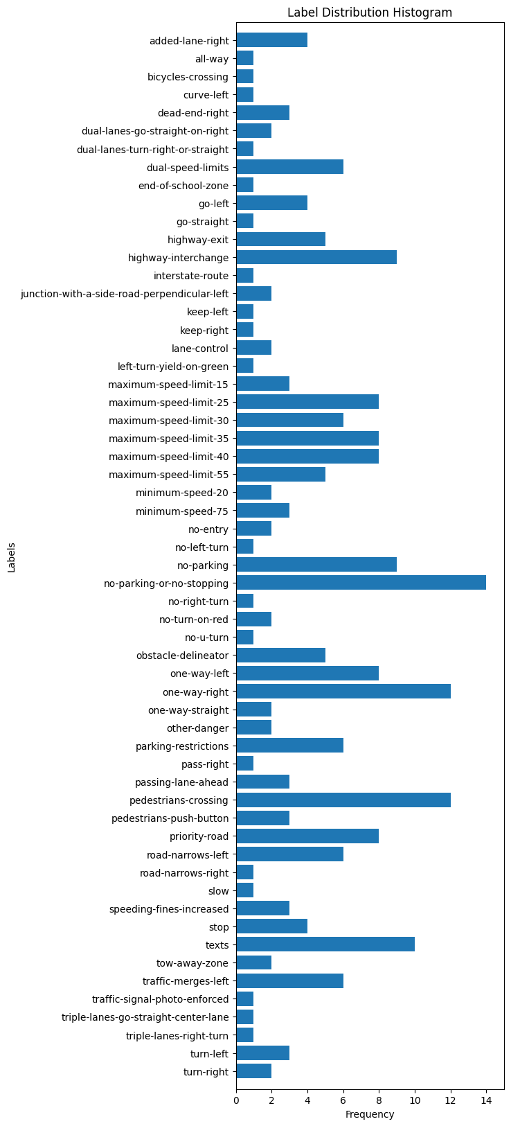
Fig. 27. The distribution of the misclassified images.
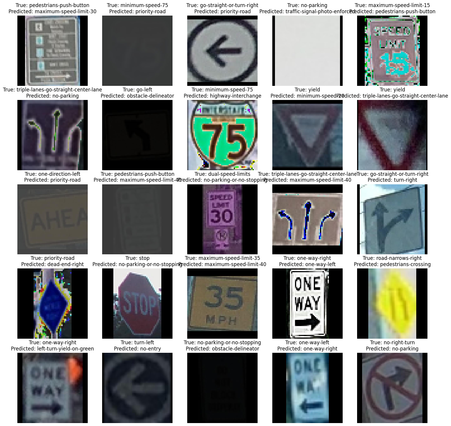
Fig. 28. A sample of misclassified images.
Figs. 29-33 show the outputs of the tuned autoencoder and encoder with different labels. We can see that in the case of “bicycles-crossing” the saturated images are misclassified and the encoder output is flat and minimal. In the case of “yield”, the autoencoder could not reconstruct the second image and it caused the classifier to misclassify the image. In the cases of “one-way-right” or “one-way-left”, the output of the encoder is very similar and the autoencoder sometimes fails to reconstruct the head of the arrows. This would be the reason for the inaccuracy, hence, the autoencoder’s reconstructions correlate with the consistency of the encoder’s output and the classifier’s accuracy. Yet, for “no-parking-or-no-stop” the classifier can predict well even though the texts are not well reconstructed. Overall, given the noisy data and complex features of each label, the classification is acting well.
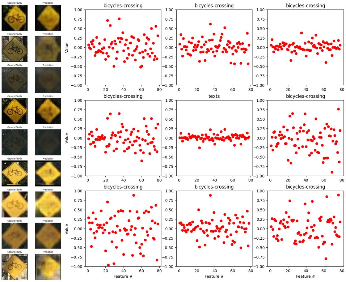
Fig. 29. The outputs of the autoencoder (left) and encoder (right) with the label “bicycles-crossing”.
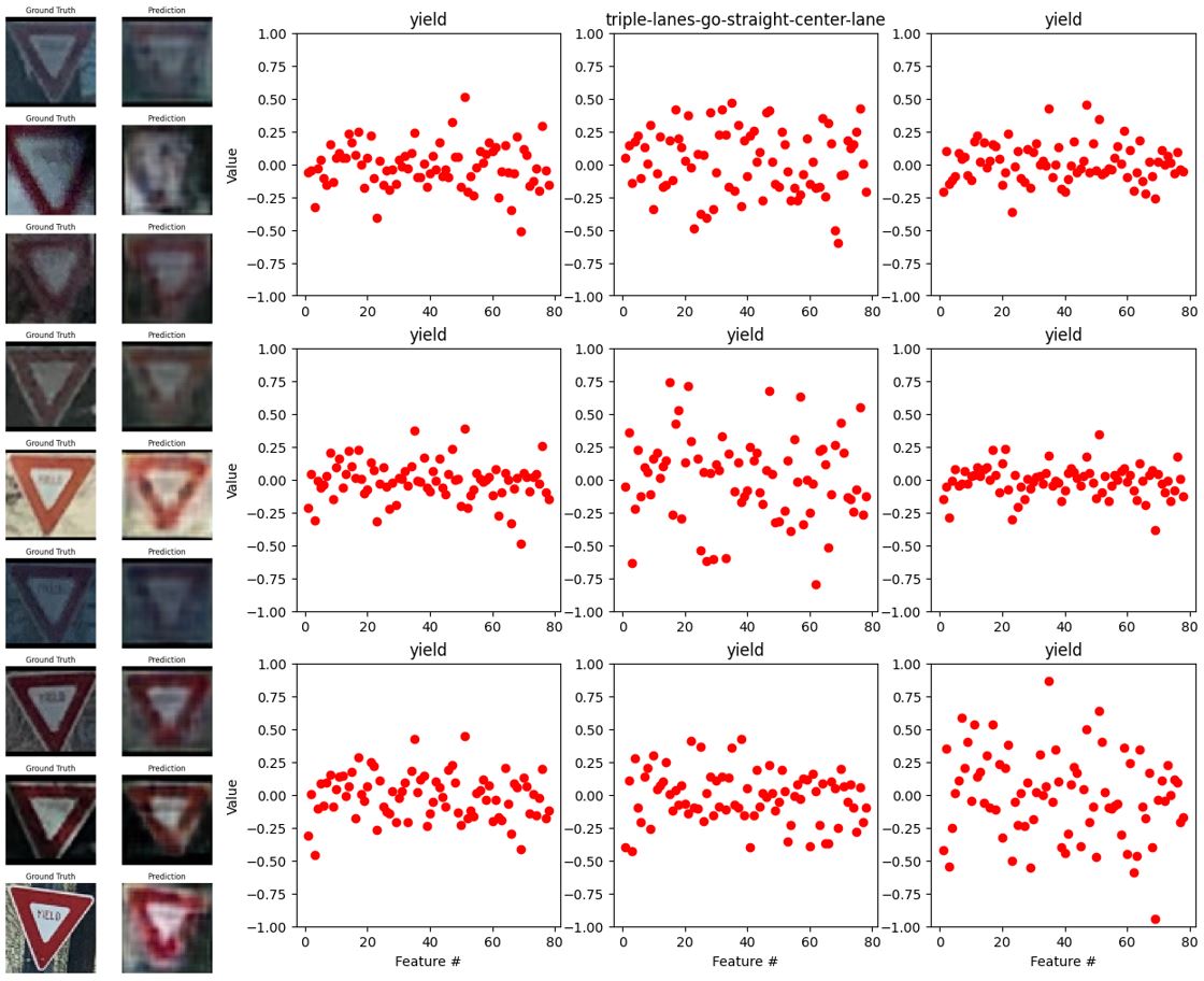
Fig. 30. The outputs of the autoencoder (left) and encoder (right) with the label “yield”.
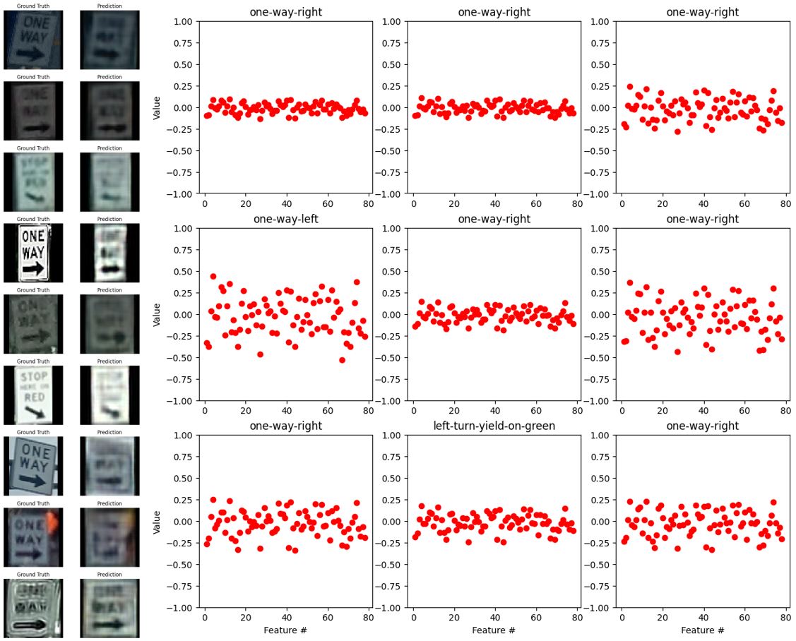
Fig. 31. The outputs of the autoencoder (left) and encoder (right) with the label “one-way-right”.
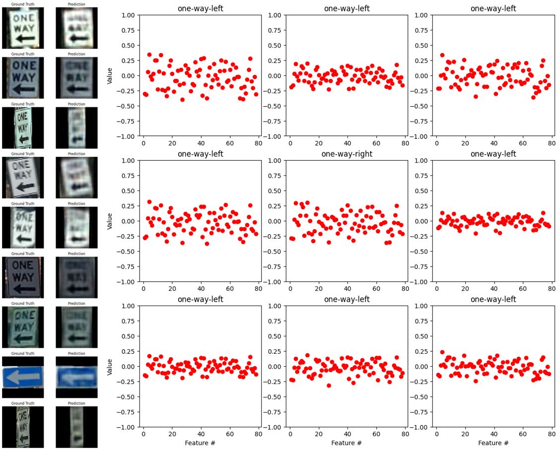
Fig. 32. The outputs of the autoencoder (left) and encoder (right) with the label “one-way-left”.
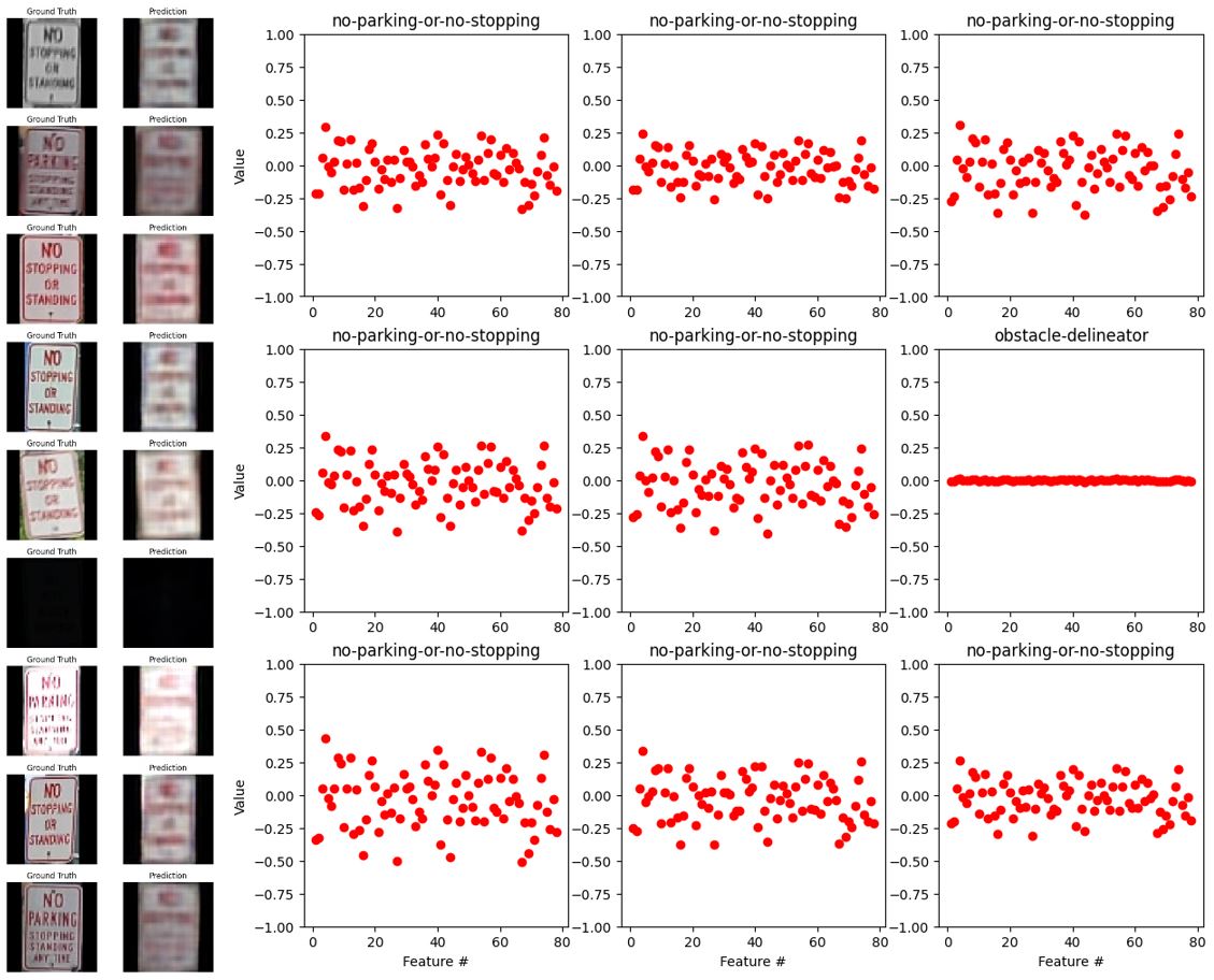
Fig. 33. The outputs of the autoencoder (left) and encoder (right) with the label “no-parking-or-no-stopping”.
Our best CNN-based model, as stated above in Fig. 14, had 1,784,542 total parameters. We trained this model for 10 epochs with a learning rate of 0.0005 to get our results. At the end of our training loop, we achieved 97.95% training accuracy and 97.71% validation set accuracy. We used Sklearn’s metrics library to calculate the overall precision, recall, and F1 scores for the testing set, as well as for each individual class. For this model, we got an overall precision of 97.38%, a recall of 97.41%, and an F1 score of 97.32% on the test set. We also used classification_report from Sklearn to calculate these values for each individual class, which can be seen in Fig. 35 below.
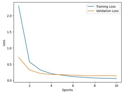
Fig. 34. Loss curve for each epoch for training and validation sets for the CNN-based model. This curve may show slight overfitting as we see the validation loss levels out sooner than the training loss.
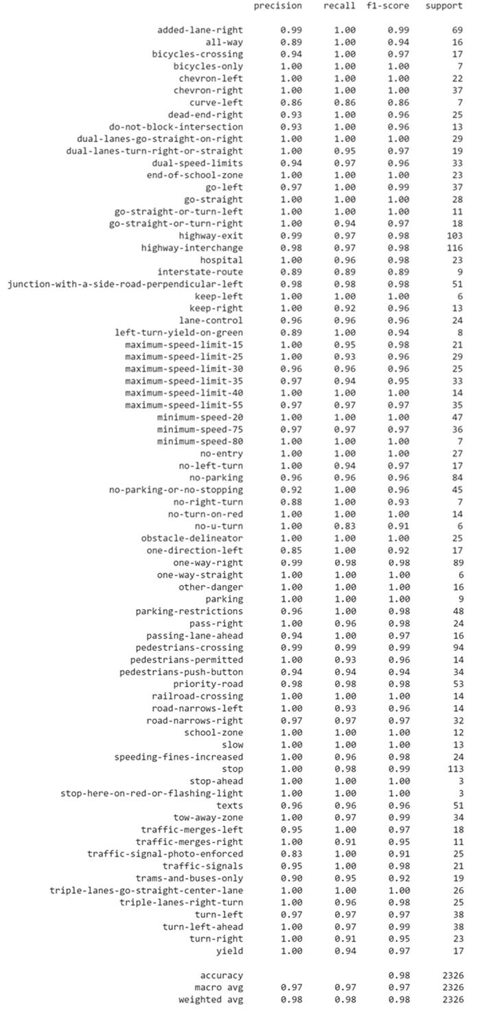
Fig. 35. Classification_report for our CNN-based model, where it denotes the precision, recall, F1 score, and support (count) of each class in the test set.
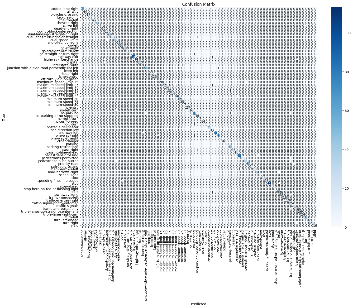
Fig. 36. Confusion matrix for the CNN-based model.
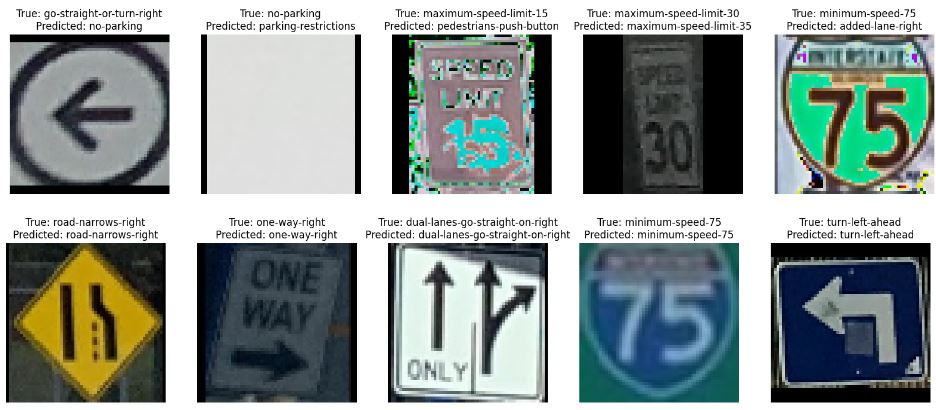
Fig. 37. A sample of signs classified by our CNN-based model, with the true label as the first line of the title and the predicted label as the second line. The first row contains all misclassified signs, and the second row contains all correctly classified signs.
We also tested several variations of our CNN model to see which model would perform better. All in all, we tested 5 different variations. In the first variation, we reduced the number of CNN blocks from 3 to 2 and saw similar results to the final CNN model. This model had an overall precision of 96.36%, recall of 96.03%, and F1 score of 96.05% on the test set. In the second variation, we tried keeping the number of CNN blocks constant with the best model (so back up to 3 blocks) and reduced the number of filters in each convolutional layer to try and reduce the number of parameters. With this model, we only had 517,108 parameters, and were able to achieve an overall precision of 95.41%, recall of 94.19%, and F1 score of 94.37% on the test set. The third model we tested was also trying to reduce the parameters even further. To do this, we added another CNN block (now 4) and reduced the number of filters in each convolutional layer, and this reduced the number of parameters down to 172,522. However, when looking at the training and validation loss curves, it appears that the model may have been underfitting slightly. So, this model only achieved an overall precision of 94.91%, recall of 92.03%, and F1 score of 92.94% on the test set.
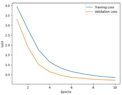
Fig. 38. Loss curve for training and validation set for the third variation of CNN-model we tested. This model had a reduction in parameters down to 172,522.
For this third model, we also tested by increasing the number of epochs from 10 to 25. With this increased value, we were able to see the distance between the loss curves reduce, as well as the overall performance of the model increase. This allowed this third model to now get an overall precision of 97.04%, recall of 95.93%, and F1 score of 96.36% on the test set.
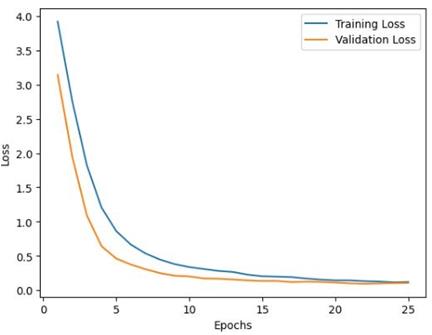
Fig. 39. Loss curves for the third variation of the CNN-based model after running for 25 epochs.
The final model we tested was an extreme reduction of the model layers. We kept only one CNN block and reduced the dense layers to just one dense layer of 78 with leaky ReLU activation and dropout, before the final dense layer of 78 and softmax activation. This model did have 986,448 parameters, but most of them came from the first dense layer, as the flattened CNN block output was fairly large in size. This final model had an overall precision of 94.39%, recall of 93.88%, and F1 score of 93.87% on the test set. Unlike the previous model, we did not increase the number of epochs because after visualizing the loss curves, the values had already intersected, indicating possible overfitting. All of the model variations we mentioned above also had fairly similar confusion matrices, so we felt it would have been extraneous to include those visuals.
As an additional test, we tested our best supervised models on some real-world pictures we took around Georgia Tech. For both the autoencoder-based model and CNN-based model, the results were similar, with the autoencoder classifying one image the CNN model could not, and the CNN model correctly classifying three images the autoencoder could not. The CNN-based model correctly classified 11/20 images, while the autoencoder correctly classified 8/20 images. For about half of the errors, the erroneous classifications from the models were reasonable mistakes, in our opinion. For example, both models had difficulty differentiating “keep right” versus “one way right.” Both of these signs are visually similar, which may be difficult for a model to differentiate with an input of only 56x56x3 pixel values. If we had access to larger and higher quality images in our dataset, maybe our models would have yielded better results on this data.
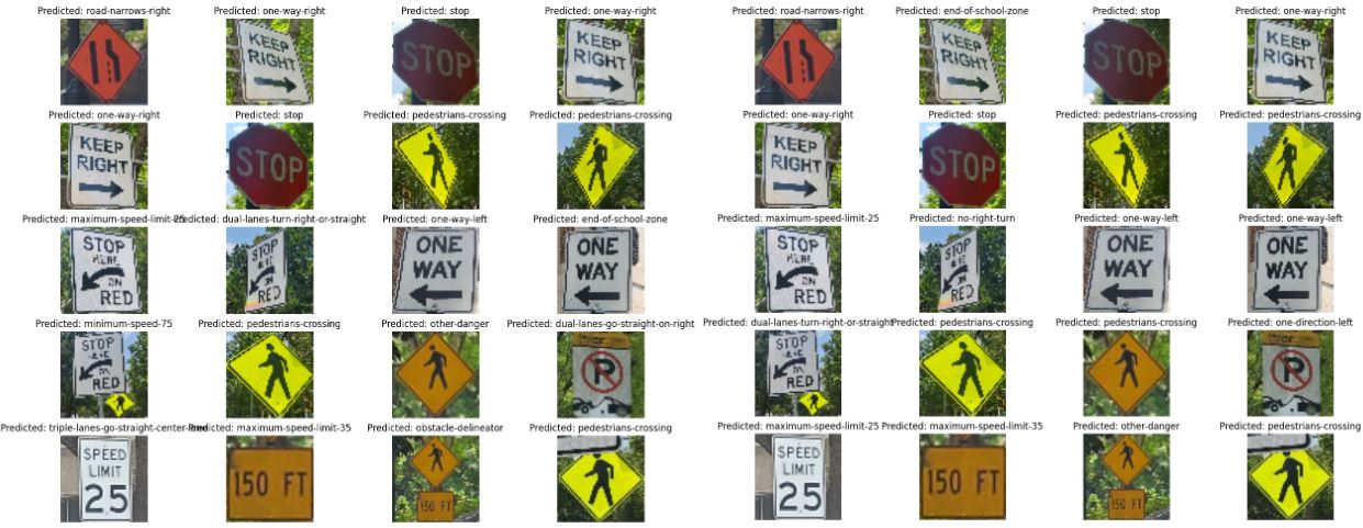
Fig. 40. Classifications of our supervised models on data we collected manually, with the autoencoder-based model output on the left and the CNN-based model on the right.
Conclusion
In conclusion, we had 3 main takeaways: the task of clustering traffic signs using an unsupervised approach is decently difficult, a CNN-based model achieves high accuracy but can easily overfit for classification while an autoencoder-based model may achieve slightly lower results with our low fidelity images but may be better in general for robustness, and a lot of our problems with the models may have stemmed from our dataset choices.
For the unsupervised model, we eventually achieved fairly good results on our last iteration of feature extraction techniques using the autoencoder model. These results show that using unsupervised learning for images might not work the best without adequate preparation of the data and feature extraction methods. To improve this feature extraction, we could expand the autoencoder model to have a larger embedding in the latent space, which could help PCA and KMeans to find better features to cluster on. Regardless, finding that the autoencoder model provided much better results than HOGs or VGG16, we can see that using the autoencoder model is much better for this data set along with seeing the F1 Scores for the supervised models.
For our supervised model, we achieved fairly good results when using a CNN-based model. However, these models seemed prone to overfitting quickly, as almost every loss graph we plotted experienced the validation loss plateauing before the training loss. Additionally, these models often required much more parameters than the autoencoder-based model, so if you needed to save compute power, using an autoencoder may be better. Another benefit of the two-stage training is having the option of transfer learning and using the same encoder with only a few last layers unfrozen for other types of image classification problems. The parameter-reduced versions of the CNN were still able to perform decently well, all things considered, and the model accuracy could always be improved by adding additional epochs or changing the learning rate to try and achieve better results.
We believe that a lot of the errors that popped up with our model likely came from our dataset. Since we had to manually scrape the data ourselves, we didn’t have the opportunity to get something like a Mechanical Turk to look over the dataset and make sure all the images were labeled correctly and were actually images of signs. As we were testing, we noticed some of the visualizations of images were completely black or completely white. This may also have been due to one of our data augmentations brightening/darkening the image for an already bright or already dark image, causing it to just look like noise to the naked eye or simply noisy data from the API. We also performed solarization as one of our data augmentation transformations to try and increase the robustness of the model, but that may have been a mistake, as often when we printed out a subsample of misclassified data points, there was always a portion of them that were augmented with the solarizing filter. In hindsight, it may have been better to add an adversarial noise filter to the data as an augmentation, instead. If we had more time to work on this project, we would have liked to really clean up this data and make sure that we are working with a dataset that will complement our chosen task a bit better.
Contribution Table
| Name | Contributions |
|---|---|
| Hoseyn A. Amiri | Assisted the team with data preparation such as building a platform to automatically get datasets from the Mapillary API and crop the bounding box of traffic signs. Analyzed primary data distribution, categorized data labels, and visualized labels for cleaning’s and post-processing’s sake. Built and analyzed CNN platform to run multiple autoencoders and classifiers followed by monitoring their errors through special visualizations. Captured and prepared outside test data collected from the campus. Wrote the corresponding parts and updated the Github page accordingly. |
| Jack Henderson | Aided group in writing code to create visualizations for the unsupervised learning model and for pre- and post-processed images in Google Colaboratory, assisting unsupervised model lead (Ethan) with revisions as requested. Assisted in write-up and copy editing of all formal reports, recording and production of all presented media, leading intermittent project meetings and maintaining written documentation, and keeping periodic communications to ensure all requirements and deliverable timelines were met. |
| Mia Markovic | Worked on understanding API calls and exploring how to get information from the Mapillary datasets. Wrote code to format the dataset csv, including removing images and doing data augmentation. Also assisted with getting some dataset visuals and writing the dataset and portions of the method and results sections of this report. Worked on building the CNN based supervised model and worked on writing sections for the final report and powerpoint. |
| Ethan T. Schneider | Worked on the Unsupervised model including, feature extraction via VGG16, HOGs, autoencoder feature extraction, PCA dimensionality reduction, Kmeans, GMM, and Hierarchical Clustering. Additionally assisted with dataset visuals and writing portions for methods and results. |
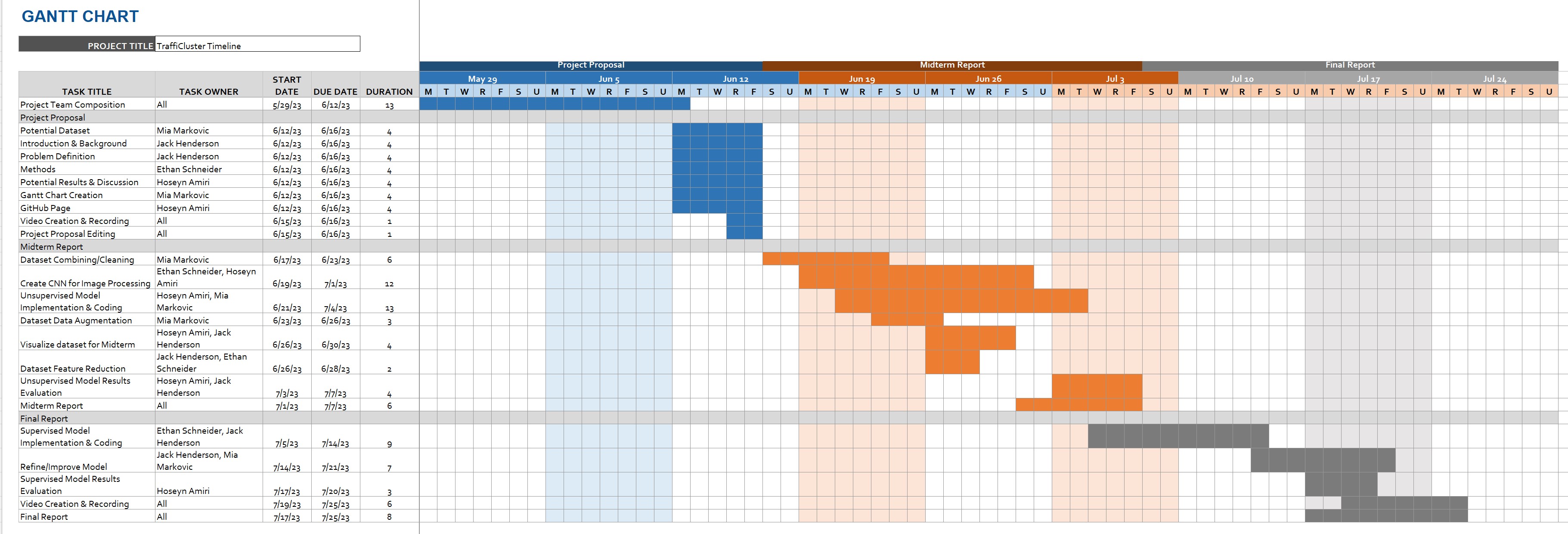
Gantt Chart
The predicted Gantt chart since the beginning of the project.
Data Availability
All data and codes are publicly available on GitHub.
Citations
@inproceedings{ertler2020mapillary,
  title={The mapillary traffic sign dataset for detection and classification on a global scale},
  author={Ertler, Christian and Mislej, Jerneja and Ollmann, Tobias and Porzi, Lorenzo and Neuhold, Gerhard and Kuang, Yubin},
  booktitle={Computer Vision--ECCV 2020: 16th European Conference, Glasgow, UK, August 23--28, 2020, Proceedings, Part XXIII 16},
  pages={68--84},
  year={2020},
  organization={Springer}
}

@article{zhang2020lightweight,
  title={Lightweight deep network for traffic sign classification},
  author={Zhang, Jianming and Wang, Wei and Lu, Chaoquan and Wang, Jin and Sangaiah, Arun Kumar},
  journal={Annals of Telecommunications},
  volume={75},
  pages={369--379},
  year={2020},
  publisher={Springer}
}

@inproceedings{zaklouta2011traffic,
  title={Traffic sign classification using kd trees and random forests},
  author={Zaklouta, Fatin and Stanciulescu, Bogdan and Hamdoun, Omar},
  booktitle={The 2011 international joint conference on neural networks},
  pages={2151--2155},
  year={2011},
  organization={IEEE}
}

@article{abdel2022riecnn,
  title={RIECNN: real-time image enhanced CNN for traffic sign recognition},
  author={Abdel-Salam, Reem and Mostafa, Rana and Abdel-Gawad, Ahmed H},
  journal={Neural Computing and Applications},
  pages={1--12},
  year={2022},
  publisher={Springer}
}

@inproceedings{singh2022dropout,
  title={Dropout-VGG based convolutional neural network for traffic sign categorization},
  author={Singh, Inderpreet and Singh, Sunil Kr and Kumar, Sudhakar and Aggarwal, Kriti},
  booktitle={Congress on Intelligent Systems: Proceedings of CIS 2021, Volume 1},
  pages={247--261},
  year={2022},
  organization={Springer}
}

@article{simonyan2014very,
  title={Very deep convolutional networks for large-scale image recognition},
  author={Simonyan, Karen and Zisserman, Andrew},
  journal={arXiv preprint arXiv:1409.1556},
  year={2014}
}

@article{wu2021hybrid,
  title={A hybrid classification autoencoder for semi-supervised fault diagnosis in rotating machinery},
  author={Wu, Xinya and Zhang, Yan and Cheng, Changming and Peng, Zhike},
  journal={Mechanical Systems and Signal Processing},
  volume={149},
  pages={107327},
  year={2021},
  publisher={Elsevier}
}